
I installed the new version of Viigo after we mentioned the update earlier this week. I have used Viigo everyday since it was called NewsClip back in the day. This makes it hard to write the following criticism. The software is free and does work like a charm…BUT (This is a big one)
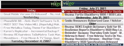
The truth is that the new version seems to be a double edged sword. As much as I love Viigo the new version is 2 steps forward and 1 step back. On one hand the application is now MUCH faster and the caching seems to be done much quicker. On the other hand there Viigo logo and banner on the top of the page has swallowed another few millimeters of screen real estate. I can’t understand what would posses Viigo to do such a thing. If anything I would have wanted them to shrink the large Viigo banner on the top of the page. Look at the screenshot below to see what I mean:
It seems like the Viigo design department needs a little customer criticism. They don’t seem to understand that they keep on making the same design flaws. Do you remember when they changed the program colors to “Fugly Green”? It was a color even Crayola couldn’t love. On a side note is it so hard to allow readers to use the spacebar to skip a page down through articles.
NOTE: For some reason the RSS link to BerryReview is not correct in Viigo’s catalog. If you want to add it just add the channel manually as Http://rss.BerryReview.com/Berryreview . I have contacted them multiple times about this but they keep on messing it up  .
.
Stefanov Not Registered
Posted: December 7, 2007 at 2:16 AM EST
There is one reason they might want to intentionally make it bigger – maybe they are going to start selling advertising in this space.
Personally, I switched to the FreeRange reader a while back after using the previous Viigo, mostly for the speed and offline caching, but also in large part because of the types of little details you mention (ability to go full screen to completely eliminate the top bar, page down with space bar, completely control both font and font size, control color scheme options, full story without using the browser). These are the kinds of things that show such a strong emphasis on quality and on the user over the importance of ‘corporate’ brand. It just feels like technically speaking FreeRange is still way out ahead in terms of thinking about how mobile products ought to work. Sure it’s not free, but nothing *really* ever is.
baobei Not Registered
Posted: December 7, 2007 at 3:23 AM EST
I think this screenshot says it all:
https://www.microsoft.com/windowsmobile/_assets/images/wmoc/viigo_screenshot.png
luc-mobile Not Registered
Posted: December 7, 2007 at 8:17 AM EST
You don’t mention anything about shortcuts, fonts, links, images and usability in general. I assume there is none of that in the new version.
Freerange is expensive, but Viigo is just not really usable in the long run. Too much lack of smart design makes it too uncomfortable. I’ve abandoned it already.
Jon Strong Not Registered
Posted: December 7, 2007 at 5:49 PM EST
Interesting to read the review and comments here. I have to admit that I’m a bit surprised, although in the world of “user experience” there are no absolutes.
I’ve been using Viigo for a few months, and just upgraded to the latest release. I’m using the unbranded version right now, and have tried two of the branded versions as well.
I was surprised to read the complaints about the UI — having been a software user, developer and executive for 20+ years, I am exceedingly interested in usability and user experience, and I was really impressed with the “Viigo experience” overall.
I see many components to user experience, including:
– ease of obtaining and installing the app
– ease of configuration
– intuitively obvious user interface
– support for both “naive” and sophisticated users
– fast UI response
– attention to UI / commands so that most common operations are readily accessible
– support from the developers / publishers
Having used Viigo extensively in the past several weeks, I actually found it to be extremely usable, friendly, intuitive, effective and fast.
Customer support has been nothing less than superb — putting billion dollar competition to shame. The company also has reps actively involved in various blackberry forums (and more, possibly, for all I know – but that’s where I see them), soliciting input, comments, suggestions — and taking these into account with subsequent releases and enhancements, which tend to come out in a matter of weeks, not months or years as with so many other software companies.
The degree of integration that they’ve recently implemented with “partner” sites like Pinstack is quite clever — I can click a button on a Pinstack forum, and have the feed appear in Viigo on my blackberry — pretty cool.
My impression is that Viigo is on a roll, innovating quickly — and will likely start to incorporate more and more of the types of features you feel are missing as they grow, although that’s only speculation on my part.
In the meantime, my experience with Viigo has been excellent — and I’ve been thrilled to have FAR more than 10 feeds always available to me — without having had to pay a penny for this. I’m not sure what their business model will evolve into, but they appear to be a creative bunch, making a good attempt at staying close to their customers, and I’ll bet they come up with effective ways of monetizing the audience without clobbering us with excessive fees.
Considering how incredibly useful and pleasant Viigo has been for me — and considering that it’s been free, I would personally feel foolish coughing up an annual subscription for another RSS reader on my Blackberry.
If Viigo keeps up the rate of evolution we’ve witnessed in the past few months, I suspect that we’ll be seeing many more innovations from them soon.
Note: I’m not a “fanboy” — just very impressed with a responsive company that is evolving a quality product very quickly. I might even have another look at Freerange…but I cannot, for the life of me, imagine what it might have added that would compel me to either cut down my feeds to 10, or pay good money for something I get, and enjoy, free as of today.
Cheers!
– Jon
luc-mobile Not Registered
Posted: December 7, 2007 at 7:52 PM EST
Great comments, Jon. But here is the problem:
.
“- intuitively obvious user interface”
“- support for both naive and sophisticated users”
.
Very true former statement. Very false latter one. Many developers make that mistake: make it either just intuitive or just cutting-edge. Just intuitive most of the times. A good application has to be BOTH, and Viigo isn’t. It is just intuitive. And limited. Come on, anyone will ace it in 10 or 20 minutes, it doesn’t have THAT many features. And once you ace it, you want to go further with it, but you can’t:
.
I can’t change fonts. => That is a major hindrance in readability. Viigo’s fonts are not that bad, but they become tiresome after some time. We should be able to adjust something which we actually look at all the time.
.
It is ugly. => Viigo doesn’t do a good job at balancing text and images/colors in full articles. We get some sort of newspaper-like pure black on white feel that is not pleasant.
.
I can’t view links in full articles. => That is a major fault. They become plain text. Viigo would force me to “open in browser” all the time. Switching back and forth between applications in a telephone device is not pleasant either. Sometimes I don’t even want to open the link. It will look awful anyway. But knowing that one given piece of text is a link can be relevant to the context.
.
I can’t view images in full articles. => Here is a nice feed for you to try in Viigo: http://feeds.feedburner.com/tapestrydilbert Not only does it look great in Freerange, I can zoom in the image and actually read the comic strip and enjoy every detail. Also in blogs (like this one), images play a very relevant role in the whole story. This one site looks good, with images and links, but that’s because you don’t need to pull the full article. Compare it with the Crackberry.com or CNET News feeds, for example. Many feeds just give a summary, we have to pull the article (pressing the trackball **twice** if you use Viigo) and as soon as we do that, the article looks awful. Different font, raw layout, no images, no links. The text might refer to some picture, and you have no idea what they’re talking about because the pictures just ain’t there. Bad experience. You don’t notice these problems? Really?
.
Not enough keyboard shortcuts. Of course a menu is incredibly intuitive, but also incredibly annoying in a program that runs on such a small device that carries features that must be accessed frequently. Launching those features from the menu all the time is a major pain. My thumb hurts from so much clicking, scrolling and selecting. Sending an article by e-mail requires the menu. Marking several articles as read/unread requires a lot of the menu. Marking several articles for “later” requires a lot of the menu. There are not enough shortcuts for all features. Or maybe there are. For the life of me, I can’t find any documentation about Viigo’s keyboard shortcuts. Try looking for them in Freerange. You just can’t miss them.
.
Another very common and nasty “intuitiveness” pitfall: I press the trackball and get a full menu. The same menu I get if I press the Menu key! Why do I need it in two buttons? Freerange is a lot more sensible: the trackball gets the full article. I suppose the Viigo developers figured that a menu was more “intuitive”. Yes, it is, but I often have to open some 35, 50 full articles in a row, and pressing the trackball twice becomes very annoying. I agree that Viigo is very intuitive, but it doesn’t seem to me that they took into the account the fact that we manage and read MANY articles every day, and that whatever may seem more intuitive if done once does not necessarily work well when quantity, scale and/or repetition gets into the equation. Many “intuitive” operations end up getting on my nerves after the 9th, 14th or 39th time I have to do them.
.
Actually, Freerange also has some of those problems, as well as many supposedly “mobile” applications. But they’re a lot worse in Viigo.
luc-mobile Not Registered
Posted: December 7, 2007 at 8:02 PM EST
Oh! Very important: Viigo also forced me to open every single damn item, even those that did not interest me, because it displays them strictly in one single line, which is not enough to hold the entire headline. So I had to open each darn single one just to read the headline and decide if I wanted to open it. Ooops! Too late – opened it already. An-noy-ing…
Jon Strong Not Registered
Posted: December 8, 2007 at 9:36 AM EST
Luc – you certainly make some interesting points, but it seems that the conversation is drifting more into personal preferences than a general evaluation of the product. Freerange may be perfect for you, but that doesn’t invalidate other products — just as Vista fits the needs of some users, but clearly not all.
I also hope it doesn’t seem that I’m attacking Freerange, as it’s clearly a powerful and rich product. But if the comparison it raised so that others will have an idea what the two products are like, it should address the pros & cons of each.
First item you mention is that you can’t change fonts. While I agree that it would be nice to override the system font when in Viigo, I personally find that Viigo’s tight integration with Blackberry system settings is an excellent design concept – at least as a starting point. Viigo uses whatever font you’ve chosen in Blackberry screen/keyboard options. For me, and most of the Blackberry users I know, the choice of a system font generally is based on personal eyesight — I chose a font that seems to be the best compromise for me balancing readability and amount of text that can be displayed at once, and this seems to be typical for most device users. When I chose the font, I was glad to see that it’s used in my email lists, email body display, calendar item display, call log — and in Viigo. This is an interesting point: I *do* appreciate the variety of fonts available to me in Freerange, but I don’t see a way to simply have it use my global choice, so that it matches the preference I’ve already selected for every other major Blackberry UI. To me, both products offer a choice, and both could learn from the other: I’d like to see Viigo offer an option to explicitly override your global font choice, and Freerange would benefit by being able to follow the global setting. BUT…for most users, having your text-based apps following a common preference is a bonus, not a detriment: if I have to choose one type of limitation over another, I personally find that Viigo wins out here. BTW: we’re just talking about a single application here — can you imagine the day when mobile devices run as many apps as our PC’s — I know that I would want to be able to have my text-based apps follow the global UI conventions as default behavior, so I could avoid having to tweak, set and modify the software publishers’ own default settings for dozens of applications. If I can’t have the whole enchilada, I prefer Viigo’s choice of UI behavior re: fonts, however I would also like to see them offer an opportunity to override if I so desire. Freerange could accomplish the same thing by simply adding the ability to use the user’s global font choice as an option.
Since you raised it, it’s interesting to compare the approach to “view full article” on both products. I actually forgot that pressing the trackball would do this in Freerange…and it’s not an option within the context menu when you’re looking at an abstract. You complain that the trackball and context menu are the same in Viigo…but I was surprised to find that the function invoked by the trackball doesn’t show up at all as a choice in the context menu – THAT makes no sense to me.
Anyway – back to “view full article”: Yes – Freerange shows you more pictures and links, but it essentially means you’re using the Freerange version of a web browser and downloading the larger content that comes with it. Not bad, but I personally like the fact that with Viigo, the “full article” gets me the full text, but still significantly faster than it would be if I chose to look at the web page. If I want to see the article in its original glory, images, links and all, I have the choice in both products to open it in a browser. But Viigo alone gives me the choice to get the full text without the overhead of the full web page. Also: in general, if I’m looking for web page functionality, I’d rather count on an external browser like the BB browser or Opera — it’s nice that Freerange can effectively render the web page itself, but that means that this is another core part of the product that will have to be supported, and continue to evolve, as the industry moves forward. It’s been my experience that such “built-in” versions of web browsers tend to lag the industry in general. Freerange may keep up, but I’m not sure it’s to their advantage. If they want to offer “view in browser” functionality, I suggest leaving it at that, while “full article” pulls down full readable content as quickly as possible – which is what Viigo does, while Freerange imitates a web browser. I’ve found that Viigo’s approach lets me browse, and read, a newspaper or magazine more quickly, and closer to the way I would browse and read a “real” paper, while still giving me the option to open an article in a browser if I really want all images and links. You find Viigo’s approach to a “full article” to be ugly: I personally find it to be a good compromise of providing functionalty, faster downloads – and still allowing me to open the article in a browser if that’s what I really want. This is just a personal preference – but Viigo’s choices work better for me in this area.
Speaking of links: I haven’t been able to reproduce this consistently, but after seeing your reply last night, I spent quite a bit of time with Freerange to see what I was missing, and ran into a problem. The very first time I tried “Access Links”, I got an “unhandled exception”. I was, at the time, a passenger in a car, and we were driving down a dark and bumpy stretch of road last night, so it wasn’t an opportune time to take notes. I got the “unhandled exception” a couple more times during that session when trying to “access links”, but I haven’t been able to duplicate it since. There’s a subtle bug lurking there somewhere, and it seems to be pretty obscure. Not a killer since I can’t even reproduce it at will…but worth resolving.
I also like the idea of providing more keyboard shortcuts. I hope that both products will attempt to follow global Blackberry standard shortcuts as a start, and add additional functionality on top of that.
I appreciate your comment re: full length article titles, although I’m not sure I’d prefer to have that on ALL the time, as it means less visible titles per screen. However I would like to be able to toggle full vs truncated with a single key when on the article list screen — for both products. That would a nice enhancement for both.
All in all, I think both products have a lot to offer. Freerange seems to have added a lot of fine-grained options, which I do like. Viigo seems to have started by having the “Viigo experience” fit more seamlessly into the overall Blackberry experience. Recent Viigo releases seem to have been responsive to user comments, and I would like to see them adding more of the kinds of features and options you’ve mentioned. In general, I find Viigo to be a quick, seamless and very effective addition to my Blackberry, well integrated with the overall experience — and I appreciate that as a general design philosophy. I agree with your general notion that more “expert” features should be added, for those who really want to customize the experience. However, if I had to choose between the two feature and design sets, for the general population, I suspect that Viigo would be more comfortable for the “average” user as an “out of the box experience”. If the folks publishing Viigo continue to layer on new features, along the lines of some of the more powerful Freerange features, but stick to their overall design philosophy, I expect that the “mature Viigo” will be a much more coherent product than the “mature Freerange”. In the meantime, I find the UI conventions in Viigo to be more transparent to the typical BB user. I’ll keep both installed and will make a point of playing with each — but so far, I find Viigo to be a much more natural experience, and I’ve been extremely impressed with the developers’ presence online, and responsiveness to questions and design suggestions. The products will, no doubt, each have their own fans. For now, Viigo fits my preferences better.
Jon Strong Not Registered
Posted: December 8, 2007 at 9:37 AM EST
Sorry for the lack of space between paragraphs on the previous note! I used notepad to edit, and pasted the article here. Unfortunately, the inter-paragraph spaces didn’t translate! I’ll re-edit on the page before submitting next time.
– Jon
luc-mobile Not Registered
Posted: December 8, 2007 at 11:04 AM EST
This is an interesting debate. I wonder if any other post has generated so much discussion as this one. Maybe yes, I’m actually new around here. I will go on with the discussion hoping that it will bring some benefit to everyone eventually. I’d like to thank Berry Review for this resource and opportunity.
.
On your first point, I can see your angle, but I don’t think that the same font really looks good across all possible applications. My BB browser font is not the same one as the global font. Also, note that the calendar uses a smaller font. I am not really happy with the Blackberry’s stock assortment of fonts to tell you the truth. I like it when an application introduces a new and more pleasant font, despite the loss of device memory. I hope the new BB OS brings more good-looking fonts, so third-party apps don’t have to waste memory with new ones. 🙁
.
On your second point, it’s really true that Freerange mimicks a browser and renders articles in their full glory. That’s Freerange’s best trick of all: it massages the content and layout and leaves it with a nearly perfect balance of text, color and spacing. Compare a blog’s “full article” in the two RSS readers: Viigo will display even titles, headers, menus, related stories and footers! And with no proper layout, so it just amounts to a fuzzy black-and-white mess that is hard to read. Viigo is not simple, it’s lazy! Just rendering pages like a browser, as you say, would be just a more “expensive” but equally lazy approach. Freerange does not do that. Instead, it seems (just seems) to remove everything that is not content and also apply some custom layout that makes the content look light and elegant. Freerange even reworks text that is otherwise squeezed around big pictures and looks
pa- xxxxxxxxxxxxxxxxxxxxxxxxxxxxxxxxxxxxxx
the xxxxxxxxxxxxxxxxxxxxxxxxxxxxxxxxxxxxxx
ti- xxxxxxxxxxxxxxxxxxxxxxxxxxxxxxxxxxxxxx
cal xxxxxxxxxxxxxxxxxxxxxxxxxxxxxxxxxxxxxx
ly xxxxxxxxxxxxxxxxxxxxxxxxxxxxxxxxxxxxxx
bro xxxxxxxxxxxxxxxxxxxxxxxxxxxxxxxxxxxxxx
ken xxxxxxxxxxxxxxxxxxxxxxxxxxxxxxxxxxxxxx
in Vi xxxxxxxxxxxxxxxxxxxxxxxxxxxxxxxxxxxxxx
igo. xxxxxxxxxxxxxxxxxxxxxxxxxxxxxxxxxxxxxx
Boy, I wish Web browsers could do that! The “overhead of the full web page you mention” is not in Freerange, it’s actually in Viigo! It’s got no colors and links in the stories, instead it’s got a lot of irrelevant junk (side bars, menus, footers etc.). Bottom line: full articles look like messy monochrome pamphlets in Viigo and like magazines in Freerange. I can’t even compare Viigo’s output to that of a newspaper. Newspapers look better than that! I mean come on, take the mobile version of any newspaper, like The Times. It looks way better than a “full article” in Viigo!
.
I’ve never had an “unhandled exception” with Freerange. I bet the developer would like to learn about that. I can’t follow links with Freerange anyway. It just stalls. Viigo will follow links and therefore take you farther, but in that ugly fashion I have described already. Anyway, following links sounds like too much to ask from any RSS reader IMO. That’s when they will actually have to become Web browsers, which they are not. But I really must know when there are links in the story. I may want to open them in the browser. They could be important.
.
Follow my example: separate paragraphs with a period. 😉
luc-mobile Not Registered
Posted: December 8, 2007 at 11:06 AM EST
Ooops! Correction: “it’s NOT really true that Freerange mimicks a browser”. I wish we could post-edit our rants. 😉
David Not Registered
Posted: December 8, 2007 at 8:33 PM EST
What annoys me MOST about Viigo (current update no exception) is the counter-intuitive use of the ‘n’ and ‘p’ keys. They operate exactly backwards from the integrated messages browser, so I have to keep remembering that when I am in Viigo if I hit ‘n’ it will go to the next message “down” the list, while everywhere else in Blackberry hitting ‘n’ will go to the next message “up” the list.
Oh, and yes, I too hate the new larger menu bar across the top.
And another thing that irritates me is having to “Open in browser” in order to access links that are embedded in an RSS post. Viigo is smart enough to underline links in the article view, but not smart enough to let me follow the link into my browser. I have to first open the article, then scroll through it to find again the link, then click it. A MAJOR pain in the backside, especially on certain sites like Fierce Wireless and InfoWorld and such. 20 presses of the spacebar just to get to the article itself once opened in the browser.