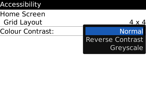
Some of you who have already handled the Bold may have noticed this small added feature on the Bold. It lets you lower the number of icons that you see on the icon homescreen. The grid options are 4×4 icons, 3×3, 2×2, & 1×1. You can see what I mean below. It also adds some cool new contrast options that you can see in action below.
Nothing groundbreaking but still cool to see that RIM is changing things up with OS 4.6. Now I just wish they would give us control of the today screen and icon placement on the special themes. I took these screenshots in the Bold simulator since it looked better than the ones sent in with the tip which were taken with a camera.
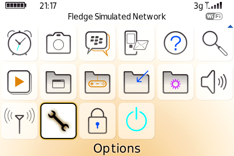
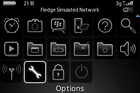
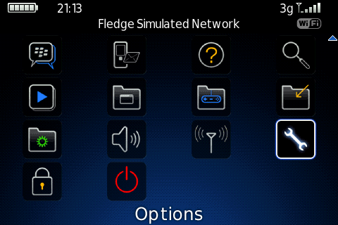
6 icons by 3 icons is the default. The new accessibility options are in options->advanced->accessibility.

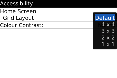
New options in order: 4×4, 3×3, 2×2, & 1×1


New contrast options: